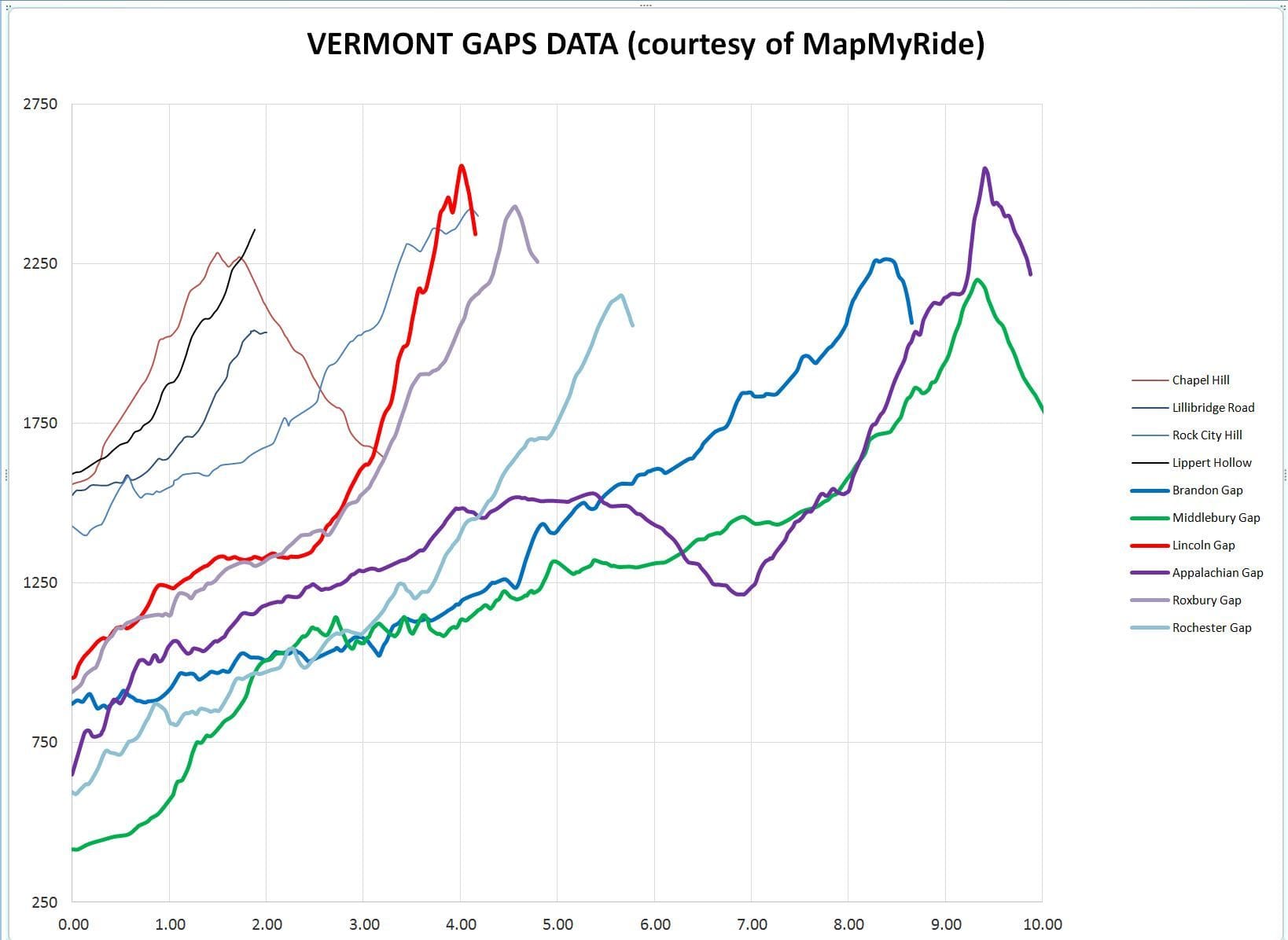
Oh, one more graph, and then I'll shut up : )
This is a graph of the six gaps elevation vs. distance; left to right, the heavy lines are: Lincoln, Roxbury, Rochester, Brandon, Middlebury (green), and Appalachian (purple). The lighter lines on the left are the four worst hills near my home. BTW, the first section of Appalachian (before it falls at 5-1/2 miles) is known as "Baby App".
When I showed this graph to my wife, she said: "But they're not much higher." I said: "Yeah, but look at how much lower they start at, how much steeper they rise, and how much longer they are".