Originally Posted by
hazetguy
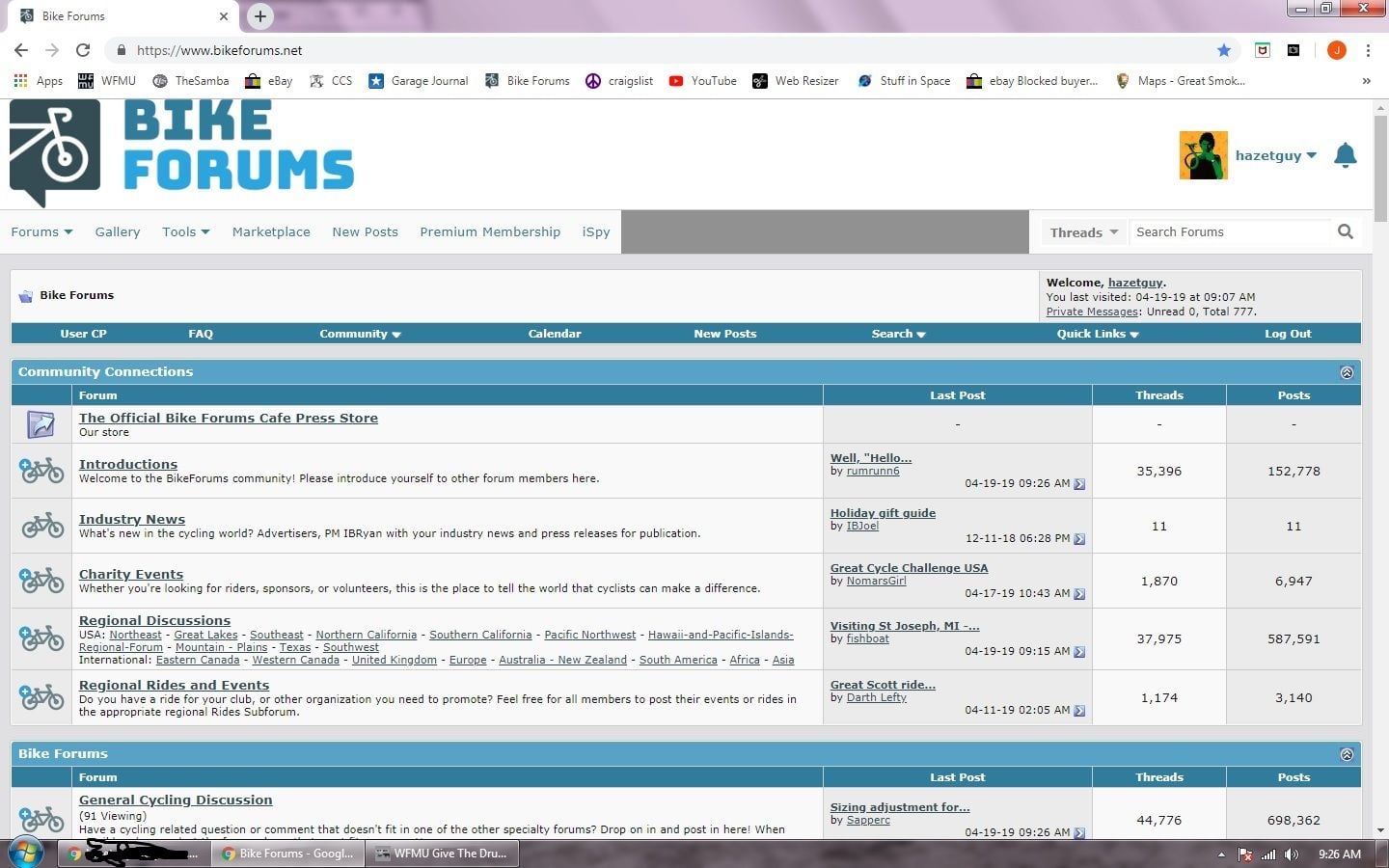
Note how large the Bike Forums logo is at the top, and also how it butts up against the very top of the page. Looks terrible. There should be some space above the logo.
Also note the large grey box along the top row of dropdown items. Yes, I logged out, cleared cookies, and it still persists, both on my desktop and my iphone.
I vote against padding around the logo.
Full bleed is best, as it allows more actual content on the screen.