Left side power meters
I had a 4iiii left side crank power meter that quit working 4 months after the warranty expired. They weren't any help to me, no repair or discount on a replacement.
I rode without a PM for 5 months in the fall and winter, and missed having one. So I got a Stages left side, which is better. No false 1-second spikes in power that the 4iiii had. (Now Stages seem to have gone out of business, surprising.)
I use it for many different pacing situations, for after ride analysis, and occasional seasonal trends tracking. I like it.
Simple analysis
Strava has some simplified analysis charts, but that's kind of a sideline for Strava. The charts aren't very useful or well designed, like much of Strava.
ridewithgps can show a sidebar of averages and a chart for any section of a ride. I just drag the red elevation chart to select. That can be useful:

~~~~~~~~~~~~~~~~~~~~~~~~~~~~~~~~~~~~~~~~~~~~~~~
Golden Cheetah
For interesting data analysis, I like the free, open source Golden Cheetah.
It has a bit of a learning curve, but it's usable with it's default settings. It's really designed for training with power, but I use it for simple analysis of rides.
I plug my Garmin in via USB, and upload a set of ride recordings. GC will skip over any already loaded days, good.
On the Activities tab, I select a ride, and usually give it a descriptive name for future reference.
The Golden Cheetah charts I like
The Ride chart
It auto calcs best intervals, 1,5,10,15,20,30,60 seconds. 5,10,20,30,45,60 minutes. And major climbs.
I can
drag the chart to make my own selections, and can give them a name.
the
"W`bal" is an estimation of short term power reserves. That sprint I selected, just before our rest stop, did take a while for my breathing to get back to normal! It shows I used up my short term reserves, yes, that's accurate.
Double clicking the interval will zoom the chart to show just that interval with more detail.

A
selected interval will show on the
Maps tab with that part of the ride highlighted, so I can see where it occurred.
~~~~~~~~~~~~~~~~~~~~~~~~~
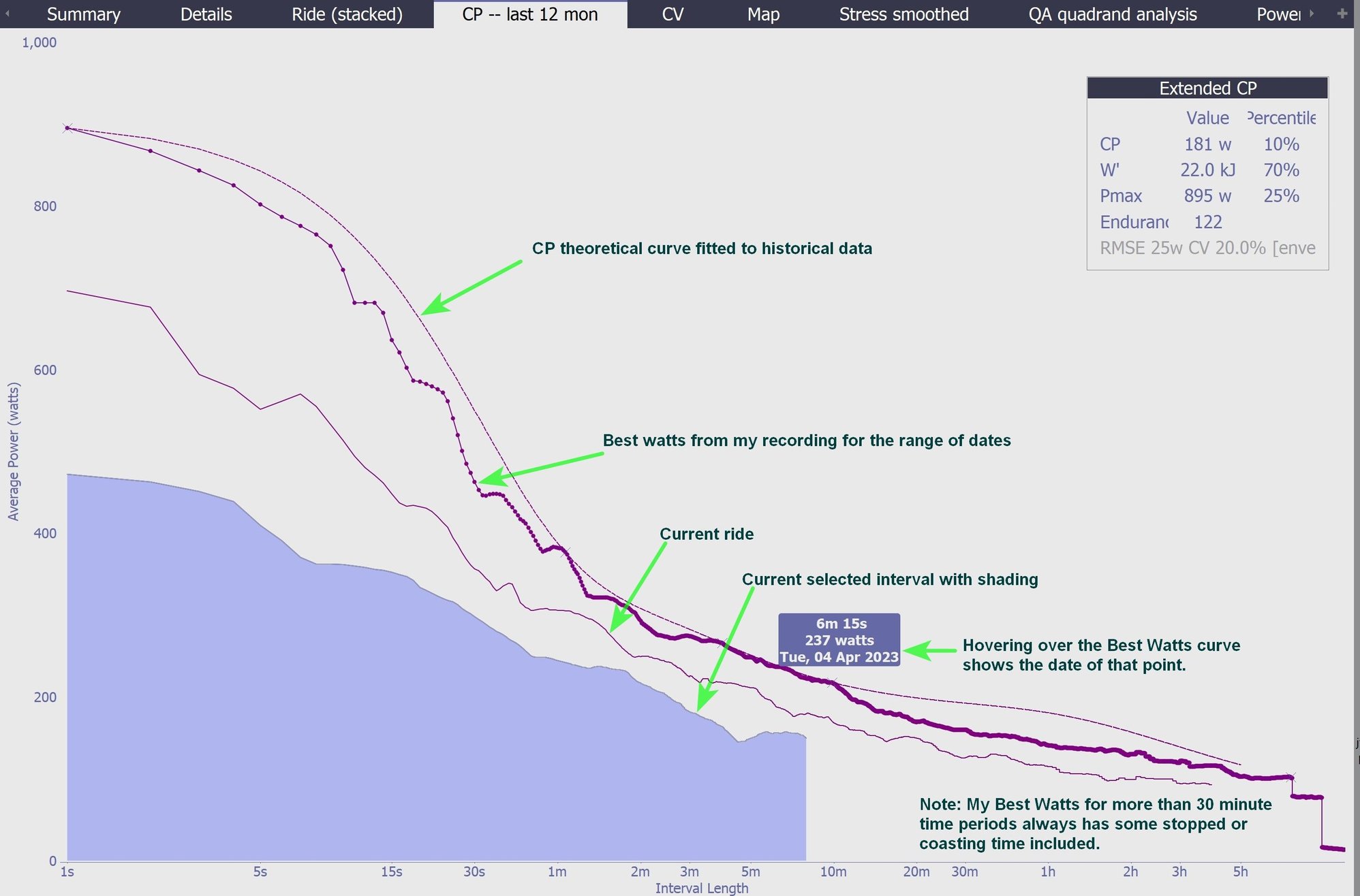
The CP chart
This is my best watts efforts, from 1 second to my longest ride. (Strava has a similar chart called Power Curve. Like much of Strava, it's not really useful--their design is too simple.)
I keep the ranges in mind for pacing all-out efforts -- what's my best 30 seconds, 1 minute, 2 minutes (which is a lot lower than my 1 minute), 5 minutes (the duration of many of the local hill climbs), etc.
For over 15-30 minutes or so, there's always some coasting, stop signs, etc, so the values are lower than I probably could maintain for that time period if I time trialed it.
It shows a dotted curve for my best efforts over the selected time period, which can be the current season, the last 30 days, a couple of years, etc.
The current ride is shown, and if there's an interval selected, it shows too.
Hovering over a spot on any of these curves shows the data numbers for that spot. Good.
See my notes added to this screen shot.
~~~~
Power-Time scatter
It's interesting just how much my power numbers change from second-to-second.
This example is one dot per second, with 5 second averaging to smooth it a little.
I just find it interesting, I'm not sure how this can be useful for training purposes.
I selected an interval, which shows in blue dots.
 Other ride tabs
Bar charts
Other ride tabs
Bar charts, with adjustable bar widths from very detailed to summarized bars:
Watts, Heart rate, Speed, Cadence.
The
Map shows the route and can show the selected interval locations.
And there are other charts that seem quite technical:
Heart rate vs power over the course of a ride.
Quadrant Analysis: Effective pedal force vs pedal velocity.
etc.
~~~~~~~~~~~~~~~~~~~~~~~~~~~~~~~~~~~~~~~~~~~~~~~~~~~~~~~~~~~~~
Seasonal Trends
There's a seasonal Trends section, with a selection of charts for tracking seasonal improvements.
It's
Summary tab shows weekly numbers, maximums, activity scatter summaries, power zone percentages, total times, etc.
The
Stress tab or the
PMC Performance Manager Chart are two different methods of tracking training "stress" improvements.
These track short term and and longer term training loads. Useful.
There are
Aerobic Power and Anaerobic Power charts, tracking best watts over the selected time frame. Aerobic is 5,10,20,30,60 minutes peak power, Anaerobic is 5,10,15,20,30,60 seconds peak.
I like these two.
Power: Time in power zones as a stacked bar chart, each bar is a ride. I've never used this chart.