Originally Posted by
Happy Feet
This graphic shows why a cross country bicycle trip may be problematic and seems a little crazy from outside the bubble right now.

Just a heads up, there's a lot of useful info in this map (the default output of the Johns Hopkins tracker if I had to guess) but also some (probably unintentionally) misleading info. All Canadian cases in this visualization are grouped into one dot
per province, placed in some fictional geographic midpoint. All US cases are
per-county, which is a much much smaller unit. Imagine instead that all the US cases were per-state and lumped into an arbitrary point in space - it would look quite different. Mexico looks to be per-state, the Caribbean is per-country; perhaps this is how the info is available but as a visualization it's problematic.
If we compare to the general Canadian population-density map:
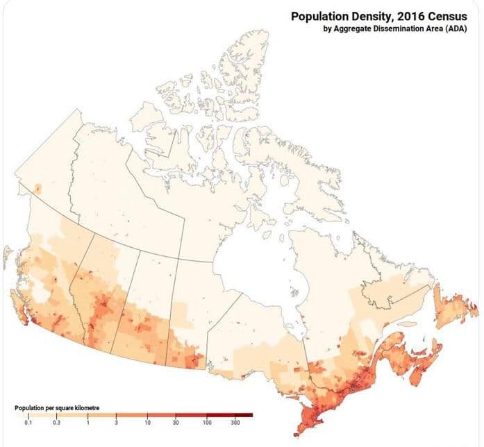
We can immediately see that the case visualization is misleading.
Please do not misinterpret me, Canada is by
many measures doing a substantially better job than the US. For instance 24 deaths per 100k people, vs 40 in the US (though also 8.1% case-fatality rate vs US 4.4% according to
https://coronavirus.jhu.edu/data/mortality on today's date).
I fully support the point of your post - if I was in Canada right now I wouldn't dream of coming to the US. But it's possible that you're more inside the bubble than you might think from the map you shared. Please do be careful!