


Why is so much bike branding super extra? (aka Logo explosions!)
 03-17-19, 09:08 PM
#26
Senior Member
Join Date: Jan 2014
Location: Southern California, USA
Posts: 10,475
Bikes: 1979 Raleigh Team 753
Mentioned: 153 Post(s)
Tagged: 0 Thread(s)
Quoted: 3375 Post(s)
Liked 371 Times
in
253 Posts
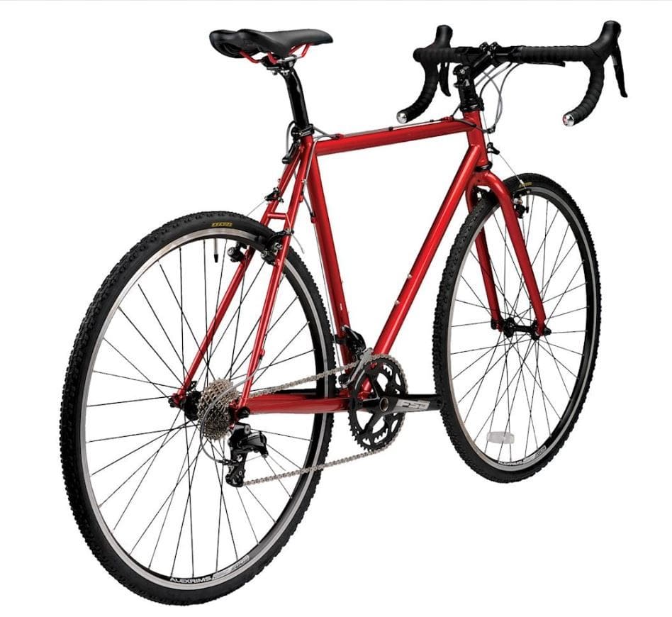
I like the plain frame. Everyone knows it is the wheels that matter.
https://cimg2.ibsrv.net/gimg/bikefor...391e2dde63.jpg
https://cimg2.ibsrv.net/gimg/bikefor...391e2dde63.jpg
 03-17-19, 09:19 PM
#27
Senior Member
Join Date: Mar 2013
Location: Tucson Az
Posts: 1,678
Bikes: 2015 Ridley Fenix, 1983 Team Fuji, 2019 Marin Nail Trail 6
Mentioned: 4 Post(s)
Tagged: 0 Thread(s)
Quoted: 337 Post(s)
Liked 228 Times
in
138 Posts
Count my matte black Ridley in.....The only places it doesn't have a bold white Ridley is on the seat stays and top tube, where it says Fenix.
Truely a rolling billboard, but it rides nice.
edit...Forgot to mention it has white on black Hed Ardennes wheels, tough to miss those too.
Truely a rolling billboard, but it rides nice.
edit...Forgot to mention it has white on black Hed Ardennes wheels, tough to miss those too.
Last edited by Wileyrat; 03-17-19 at 09:23 PM.
03-17-19, 09:21 PM
#28
Senior Member
If I was a racer I'd like a "loud" bike. I like them all but no way am I going there. My conditioning doesn't match the logo.
03-18-19, 02:21 AM
#29
Member
Join Date: Sep 2017
Posts: 32
Mentioned: 0 Post(s)
Tagged: 0 Thread(s)
Quoted: 7 Post(s)
Likes: 0
Liked 1 Time
in
1 Post
ahaha
it makes me laugh everytime i'm looking bikes in shops.
it's interesting to see how designers manage to put such big logos on bike parts.brands should give a monthy fee to theyr customers.
one of the things i like about some dutch style bikes is the clean painti scheme, the owners can easily paint over.
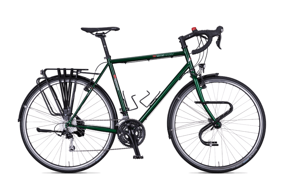
also i noticed that sometimes a smaller logo is more effective than a big one. for example you easily spot a fahrradmanufaktur, even if they look sober
it makes me laugh everytime i'm looking bikes in shops.
it's interesting to see how designers manage to put such big logos on bike parts.brands should give a monthy fee to theyr customers.
one of the things i like about some dutch style bikes is the clean painti scheme, the owners can easily paint over.
also i noticed that sometimes a smaller logo is more effective than a big one. for example you easily spot a fahrradmanufaktur, even if they look sober
03-18-19, 02:33 AM
#30

WALSTIB

I like fancy paint and clever branding and even blingy head badges. But giant letters isn�t doing it for me.
Shamrock Bikes is really clever.
https://www.instagram.com/p/BvIF3u1g...on_share_sheet
 03-18-19, 04:43 AM
#31
Advocatus Diaboli

Join Date: Feb 2015
Location: Wherever I am
Posts: 8,638
Bikes: Merlin Cyrene, Nashbar steel CX
Mentioned: 14 Post(s)
Tagged: 1 Thread(s)
Quoted: 4736 Post(s)
Liked 1,532 Times
in
1,003 Posts
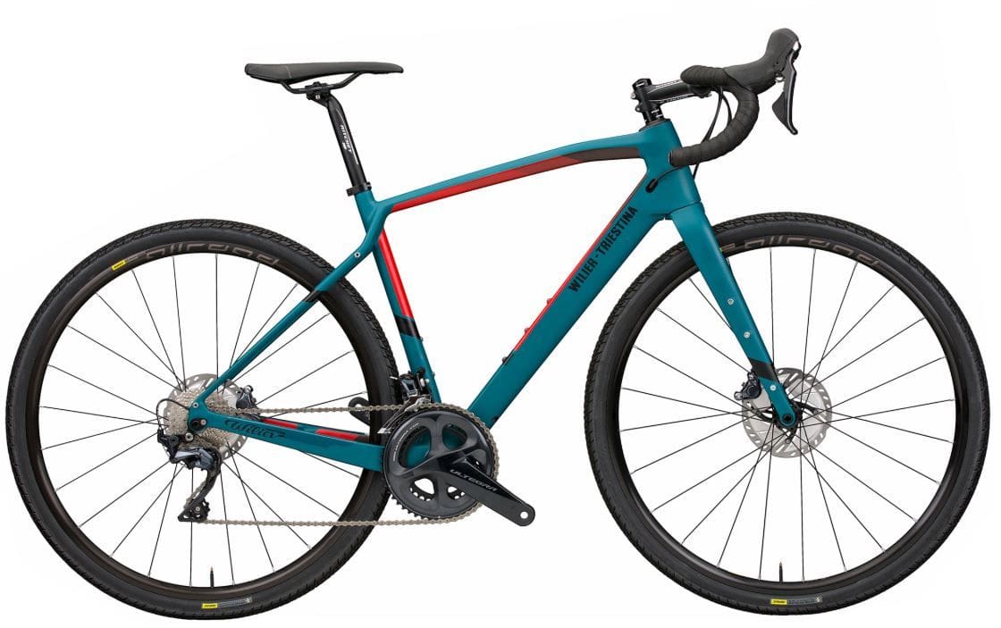
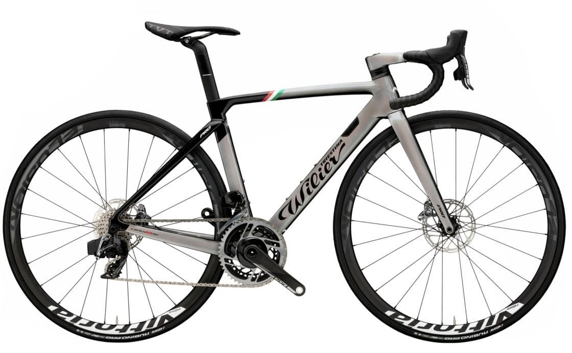
Some companies have model lines that have chosen the more subtle route.. eg. compare Wiler's gravel vs road bike logoing
03-18-19, 05:23 AM
#32
Senior Member
Join Date: Jan 2010
Posts: 39,244
Mentioned: 211 Post(s)
Tagged: 1 Thread(s)
Quoted: 18420 Post(s)
Liked 15,563 Times
in
7,333 Posts

 03-18-19, 05:47 AM
#33
Senior Member
Join Date: Dec 2012
Location: North Central Florida
Posts: 821
Bikes: 2022 LiteSpeed CHEROHALA CITY, 2019 Canyon Roadlite 9.0 CF LTD, 2015 Giant FastRoad CoMax 1, 2001 Mongoose Pro Triomphe,
Mentioned: 7 Post(s)
Tagged: 0 Thread(s)
Quoted: 129 Post(s)
Likes: 0
Liked 84 Times
in
50 Posts
I know what you mean. I didn't even bother to count the number of Giant labels on our FastRoad CoMaxs but on the RX Composites Giant was very proud of their product. If I remember correctly there were 25 Giant labels plasted all over the bike. I did remove some when upgrading parts however. It just one of the reasons I love our new Canyons... Can only find one Canyon label and a few Canyon icons.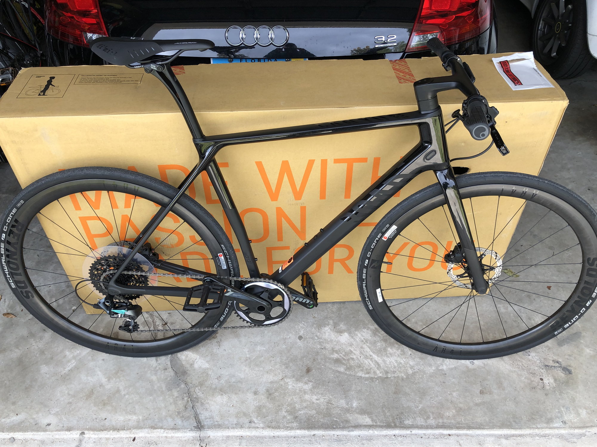

 03-18-19, 06:51 AM
#35
WALSTIB
Logos only thing gives a carbonfiber bike any looks. Otherwise looks like their popped out of a plastic mold.
03-18-19, 07:09 AM
#36
Sophomore Member

Join Date: Jan 2019
Posts: 2,531
Mentioned: 12 Post(s)
Tagged: 0 Thread(s)
Quoted: 1628 Post(s)
Liked 1,059 Times
in
633 Posts
It's nice to have many bikes, some with lots of Logos, and others with No Logos. Some days I'm in Logo mood, other days I'm in a Stealth mood. It's the best of both worlds. I do like to have at least some minimal branding though, so I don't have to answer everyone's questions about who made the bike. That can get annoying, especially if it's some odd foreign brand name you're not 100% sure how to pronounce, like Faggin or Ci�cc.
03-18-19, 07:13 AM
#37


Senior Member
Join Date: Jul 2010
Posts: 5,791
Mentioned: 6 Post(s)
Tagged: 0 Thread(s)
Quoted: 1020 Post(s)
Liked 463 Times
in
293 Posts
Old bikes tend to be understated. New bikes are not, but can be�it all depends on the manufacturer�s desire (or need) to scream out its name.
03-18-19, 07:47 AM
#38
Sophomore Member
Join Date: Jan 2019
Posts: 2,531
Mentioned: 12 Post(s)
Tagged: 0 Thread(s)
Quoted: 1628 Post(s)
Liked 1,059 Times
in
633 Posts
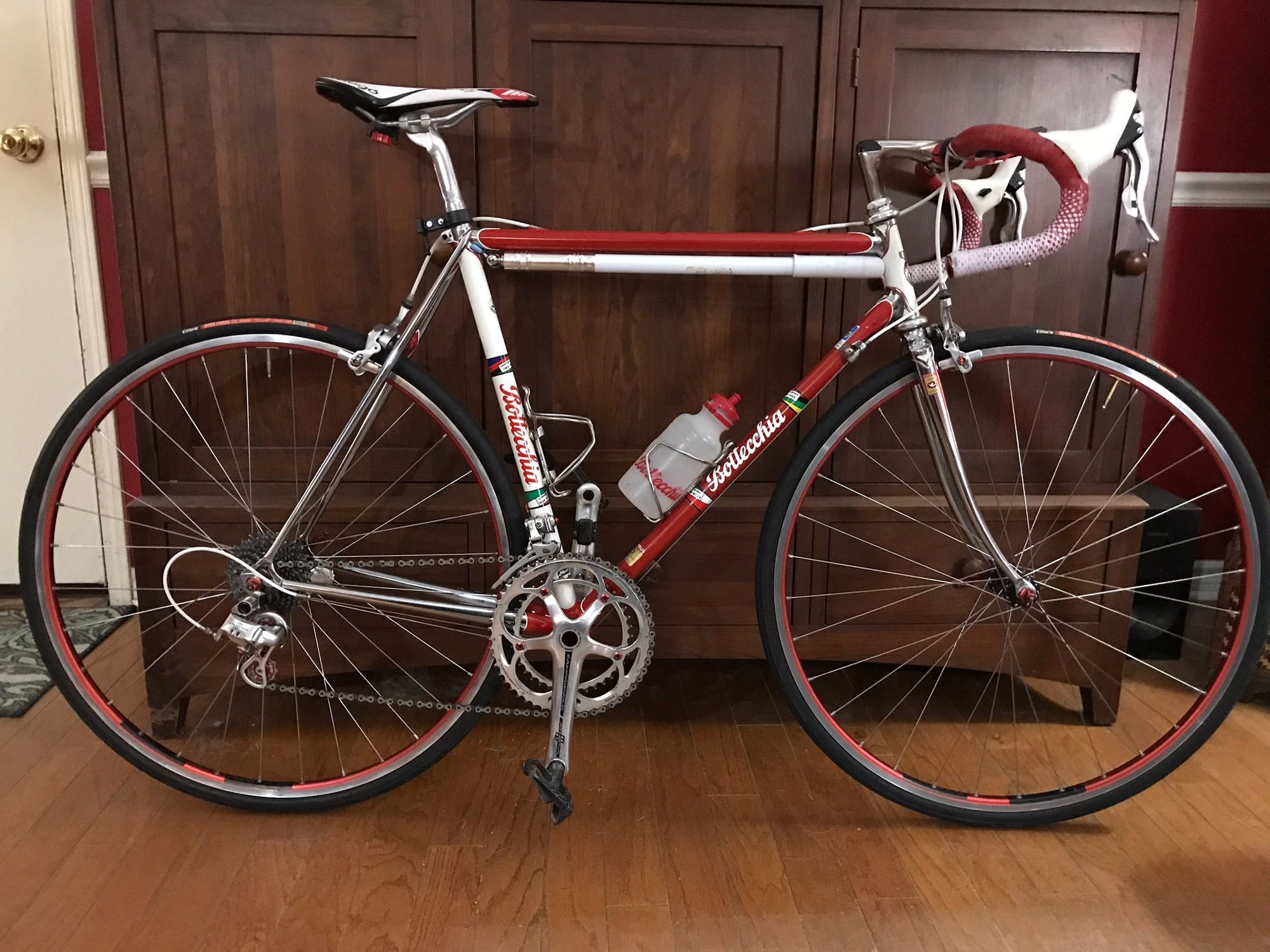
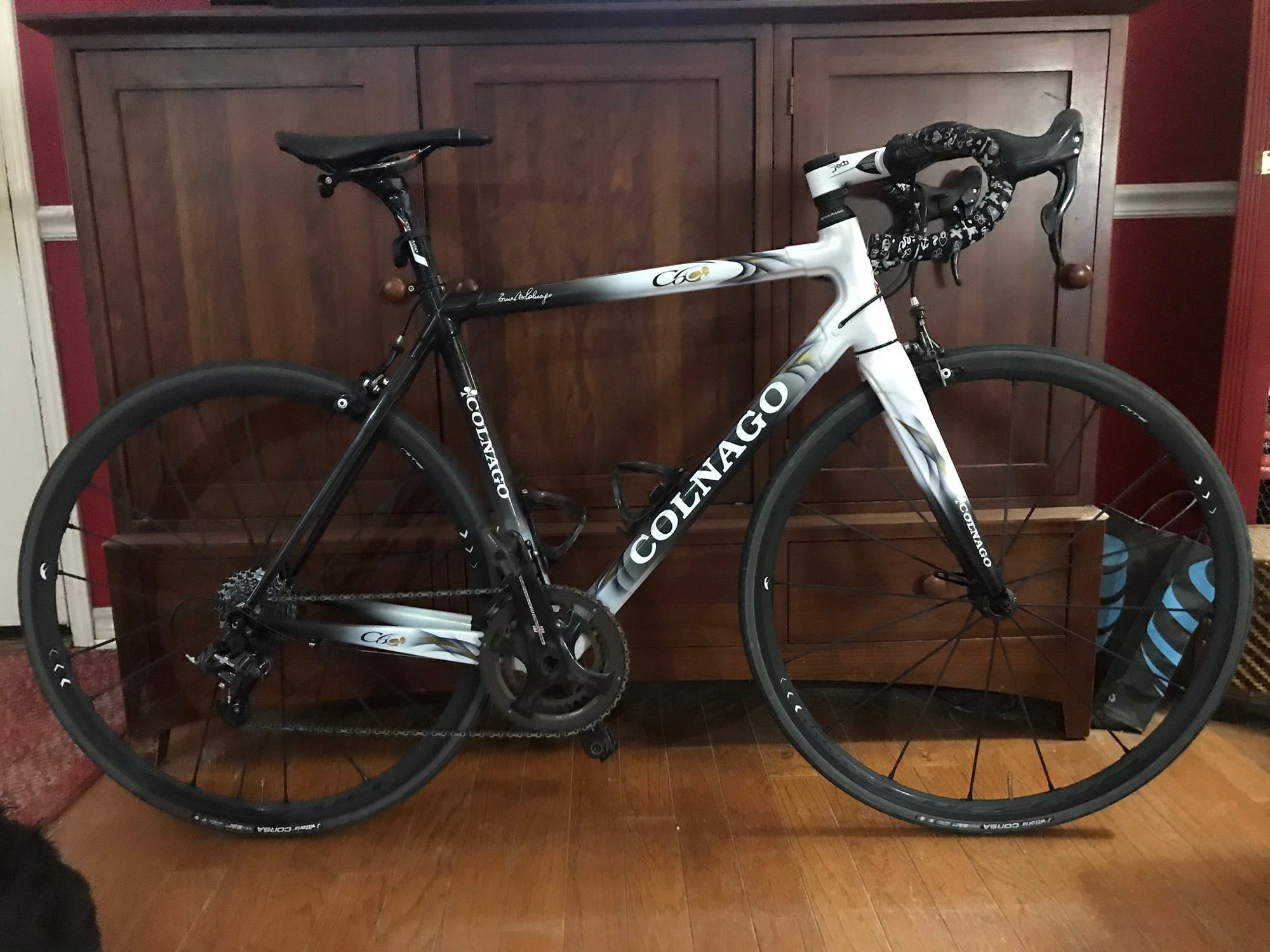
Those two bikes strike a perfect balance, IMO. The Bottecchia lets the chrome do the talkin'. And the Colnago lets the brand name do the talkin'.
03-18-19, 02:30 PM
#39
Lopsided biped
Join Date: Nov 2017
Location: NE Ohio
Posts: 737
Bikes: 2017 Day 6 Cyclone (the Buick); 2015 Simcoe Deluxe (the Xebec); Street Strider 3i (the not-a-bike); GreenSpeed Anura (the Black Swan)
Mentioned: 3 Post(s)
Tagged: 0 Thread(s)
Quoted: 316 Post(s)
Liked 160 Times
in
97 Posts
They're robbing riders of opportunities for social engagement. Nobody's going to come up and say, "Wow, nice bike, who makes that?" when they can read it from across the street.
03-18-19, 02:47 PM
#40
Senior Member
Join Date: Oct 2014
Location: Portland, OR
Posts: 12,906
Bikes: (2) ti TiCycles, 2007 w/ triple and 2011 fixed, 1979 Peter Mooney, ~1983 Trek 420 now fixed and ~1973 Raleigh Carlton Competition gravel grinder
Mentioned: 129 Post(s)
Tagged: 0 Thread(s)
Quoted: 4806 Post(s)
Liked 3,931 Times
in
2,556 Posts
My three customs have their logos on the downtube plus headbadge/stickers and a sticker on the seat tube. My custom stems have stickers. The two stock bikes got powder coats and no logos except the headbadges went back on. I received the Trek decal-free. The Raleigh Competition came with all decals but brazing so poor there was no way I was going to give Raleigh credit for a QC disaster. (I paid a local frame builder half a grand for the brazing that should have been there when the bike left the factory,)
Ben
Ben
 03-22-19, 03:57 PM
#41
Advocatus Diaboli
Join Date: Feb 2015
Location: Wherever I am
Posts: 8,638
Bikes: Merlin Cyrene, Nashbar steel CX
Mentioned: 14 Post(s)
Tagged: 1 Thread(s)
Quoted: 4736 Post(s)
Liked 1,532 Times
in
1,003 Posts
My non-custom bike curiously gets a lot of queries as to whether it is in fact custom. "no.. I got it mailorder from Nashbar.."
03-22-19, 04:40 PM
#42
Senior Member
Join Date: Jul 2010
Posts: 5,791
Mentioned: 6 Post(s)
Tagged: 0 Thread(s)
Quoted: 1020 Post(s)
Liked 463 Times
in
293 Posts
I love Ernesto�s bikes, but sometimes Colnagos can be a bit gaudy.
03-22-19, 08:03 PM
#43
- Soli Deo Gloria -
Join Date: Aug 2015
Location: Northwest Georgia
Posts: 14,779
Bikes: 2018 Rodriguez Custom Fixed Gear, 2017 Niner RLT 9 RDO, 2015 Bianchi Pista, 2002 Fuji Robaix
Mentioned: 235 Post(s)
Tagged: 0 Thread(s)
Quoted: 6844 Post(s)
Liked 736 Times
in
469 Posts
Since everyone is posting their bikes...
03-22-19, 08:14 PM
#44
Banned.
Join Date: Aug 2009
Posts: 509
Bikes: The Good Book of bicycling
Mentioned: 7 Post(s)
Tagged: 0 Thread(s)
Quoted: 535 Post(s)
Liked 36 Times
in
29 Posts
going to miss the old nashbar, it seems many of their bikes had no logos at all on the down tubes. they also came with very good pricing and step up components. maybe a bike company or the next nashbar will take note of that.
03-22-19, 10:06 PM
#45
Full Member
I know what you mean. I didn't even bother to count the number of Giant labels on our FastRoad CoMaxs but on the RX Composites Giant was very proud of their product. If I remember correctly there were 25 Giant labels plasted all over the bike. I did remove some when upgrading parts however. It just one of the reasons I love our new Canyons... Can only find one Canyon label and a few Canyon icons.
 03-25-19, 01:33 AM
#48
Banned.
Join Date: Sep 2007
Location: Carlsbad, CA
Posts: 6,434
Bikes: '09 Felt F55, '84 Masi Cran Criterium, (2)'86 Schwinn Pelotons, '86 Look Equippe Hinault, '09 Globe Live 3 (dogtaxi), '94 Greg Lemond, '99 GT Pulse Kinesis
Mentioned: 19 Post(s)
Tagged: 0 Thread(s)
Quoted: 389 Post(s)
Liked 270 Times
in
153 Posts
Hey, at least your overstated logo isn't in comic sans. 

03-25-19, 10:06 AM
#49
Senior Member
Lots of casual cyclists want their bikes to look like pro race bikes: festooned with sponsor logos, aggressive looking and "racy". Consumerism certainly plays a part in that desire, but it's also an aesthetic choice. Beyond just advertising, well chosen logo design can add graphic interest to a bike frame and break up the lines. This is especially true with today's slab-sided "aero" design preferences. For example, a de-logoed Madone would look blocky and ungainly. I actually like the incredibly giant logo on the team red Madone, it's outrageous like that bike.
Also, this is nothing new. Look at any pro race bike from the 1980s on, all were slathered with brand names. I had a Tommasini back then that had logos everywhere: down tube, seat tube, chainstays, seat stays, fork blades... even the lugs and fork crown had script "T" logos.
Note: my current bike is flat/gloss black with subtle logos. I'm largely with you guys on this.
03-25-19, 10:28 AM
#50
Senior Member

Join Date: Apr 2015
Location: Metro Detroit/AA
Posts: 8,207
Bikes: 2016 Novara Mazama
Mentioned: 63 Post(s)
Tagged: 0 Thread(s)
Quoted: 3640 Post(s)
Liked 81 Times
in
51 Posts
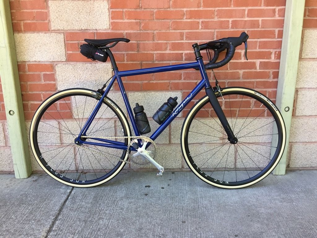
I like the branding on my Mazama. Can't really see it, but the name is on the downtube is slightly a darker shade than the red:
Then again, some branding can be acceptable if done in a tasteful way. I wish they hadn't blended orange and green and made me look like a Miami fan, but I do like the style and sizing on the fat bike. I don't like the Synchros (I assume Scott's in-house component "brand") plastered on the components, or the RaceFace on the cranks tho:
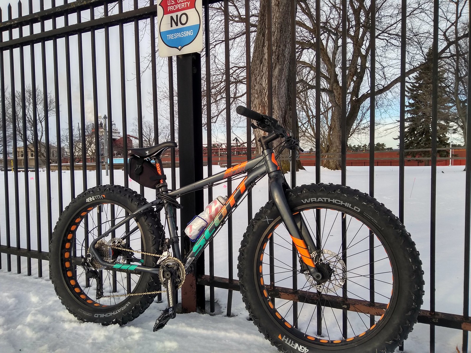
Then again, some branding can be acceptable if done in a tasteful way. I wish they hadn't blended orange and green and made me look like a Miami fan, but I do like the style and sizing on the fat bike. I don't like the Synchros (I assume Scott's in-house component "brand") plastered on the components, or the RaceFace on the cranks tho: