


Flyout bar for navigation issues
 11-01-20, 12:56 PM
#1

I'm good to go!
Thread Starter
Join Date: Jul 2017
Location: Mississippi
Posts: 14,985
Bikes: Tarmac Disc Comp Di2 - 2020
Mentioned: 51 Post(s)
Tagged: 0 Thread(s)
Quoted: 6193 Post(s)
Liked 4,808 Times
in
3,316 Posts
Flyout bar for navigation issues
Some time ago you added the flyout bar at the top that comes down and shows the hierarchy for returning from that thread. Great thing and I'm glad you added that.
But for threads with really long titles the hierarchy links disappear from that flyout and all that is seen is the thread title. Then I have to go to one of the many other ways to get out that aren't as convenient or habit for me.
One thing I noticed is this also seems to have some to do with how wide I have my browser window on my display. I use a widescreen 24 inch display typically and only draw out my browser window a 1/3 to just less than half my display width of 1980 pixels. If I go over half my display width, the problem fixes itself. Happen on my macbook too, but not sure what the resolution is currently and when exactly it tends to happen. My browser is wider compared to pixel width on it since it's screen is much smaller.
I'm thinking this has something to do with how fonts scale and objects in a frame rearrange themselves based on window size and trying to anticipate whether being viewed in portrait on a mobile device like a cell phone or not. Particularly since at the point this happens, the font scale of the thread title gets really big instead of smaller to allow the rest of the hierarchy to be displayed.
Anyhow... if y'all will keep this in mind to maybe adjust when you find time I at least will appreciate it.

 11-04-20, 02:17 PM
#3
I'm good to go!
Thread Starter
Join Date: Jul 2017
Location: Mississippi
Posts: 14,985
Bikes: Tarmac Disc Comp Di2 - 2020
Mentioned: 51 Post(s)
Tagged: 0 Thread(s)
Quoted: 6193 Post(s)
Liked 4,808 Times
in
3,316 Posts
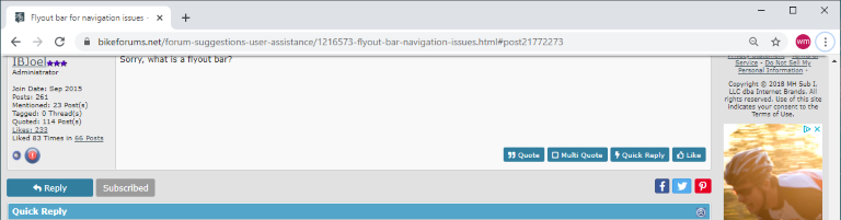
I don't know. That's all I could think of to call it................... What about dropdown bar?
Anyway, when I'm reading down through a thread and the screen scrolls up the menu bars and stuff disappear and it looks like this...........
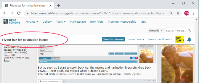
But as soon as I start to scroll back up, the menus and navigation hierarchy drop back down..... neat stuff, but missed when it doesn't work.
The red circle is mine, just to make sure you are looking where I want. <grin>

Here is when the window is narrowed up and the navigation hierarchy disappears. But notice all the wasted space where it could show.
Anyway, when I'm reading down through a thread and the screen scrolls up the menu bars and stuff disappear and it looks like this...........
But as soon as I start to scroll back up, the menus and navigation hierarchy drop back down..... neat stuff, but missed when it doesn't work.
The red circle is mine, just to make sure you are looking where I want. <grin>
Here is when the window is narrowed up and the navigation hierarchy disappears. But notice all the wasted space where it could show.
Last edited by Iride01; 11-04-20 at 02:23 PM.
11-05-20, 12:24 PM
#5
I'm good to go!
Thread Starter
Join Date: Jul 2017
Location: Mississippi
Posts: 14,985
Bikes: Tarmac Disc Comp Di2 - 2020
Mentioned: 51 Post(s)
Tagged: 0 Thread(s)
Quoted: 6193 Post(s)
Liked 4,808 Times
in
3,316 Posts
I've been on other sites that I see this happening more and more, since those sites are using a lot of fancy graphics, they become pretty unusable or at least frustrating to navigate and use.
I don't want my browser open as far as you and others seem to want me to open it.
