Originally Posted by
SirMike1983
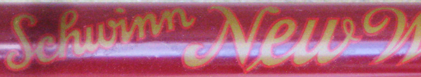
The decal looks pretty good to me, though I will say I'm not an expert at designing and duplicating decals. The only pointer I would give, is that it looks to me as if the in the originals, the red outline is a shade thinner around the gold inner lettering. But you certainly have a nice decal going there.
I noticed that when you sent the photos of yours for measurements. Since the file is SVG, it can be changed anytime without any quality loss. However, here is the reference I used , and there the outline seems somewhat thicker (still not as thick as my drawing), and actually looks like if it was spray painted and outlined by hand painting, which is obviously not the case.
Unfortunately, since these are 2 separate vinyl layers it is really hard to stick them on top of each other to avoid some offset around, however even that could be interpreted by the untrained eyes as a style feat, but as I said, I can only offer some help with the "better than nothing" way, not the "Gus, is that you?" one.