Originally Posted by
dmarkun
Very interesting information.
If the reference art is a photo of the art on a bike, and the artist then recreates it ... The original bike decal is very distorted because it wraps around the tubing. Is this distortion removed by the skill of the artist or is there a de-warp tool that helps? Or maybe something like multi photo merge from different photo angles? (My wife says I tend to overthink things).
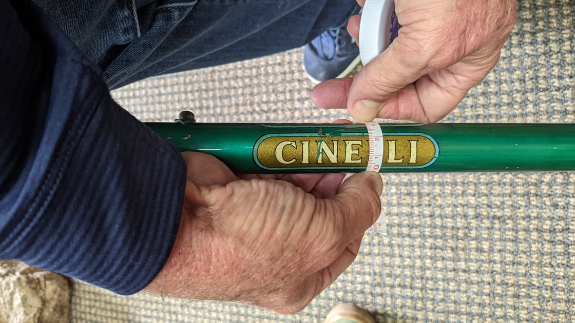
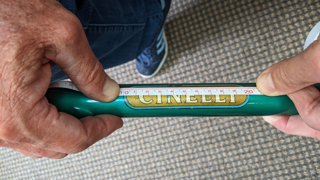
Generally, the designer figures it out. In most cases, the wrap is minimal and the "warp" is also minimal. In the example below, the flat image of the "wrap" is 19.5mm. As you can see in the other picture, the measurement is 23mm. I'll assume things like the round ends are actually round. Pictures at 10 and 2 help. Sometimes you get lucky and have flat originals.
While those versed in the art can see things that are "wrong", most don't. In my opinion, the wrong "distortion" is a less noticeable error. What's glaring to me is the perfection of computers. Back in the day, this artwork was scaled up 5-10 times, with pen and ink on paper. Prone to the ink bleeding. That was scaled down with the film to make the screens. Each color is it's own screen. Alignment, or what we call registration, of those screens was not often good. So in the Paglianti artwork, all lines are exactly the same width. The color lands perfectly within the lines. That ain't the case of original decals. Colors bleed into one and another. Lines vary in width and also bleed making them "lumpy".