Originally Posted by
razorjack
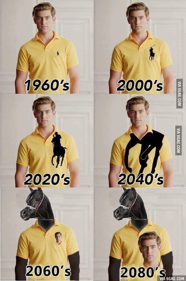
I see so many ppl riding in Pas Normal Studios jerseys and bib shorts, however they look completely tasteless.... just big white letters (they could use comic sans font as well....) on the back, no style at all.
Rapha started following the trend, before there was smaller 'rapha' logotype in a nice looking font, now 'rapha' logotype is bigger and in a few places and with tasteless font...
Is it just to show off that you paid stupid money (looking at PAS) for your outfit ?
(I'd understand if there is 2x difference in performance etc. but there is non at the end, comparing to few other a bit more expensive brands (like Castelli or Sportful).

You should write to TREK. They have the ugliest and biggest writings I've ever seen on a bike!
FYI, people can say what they want, but more expensive clothes = better.
My PNS bibs remain comfy even after 7+ hours of riding. Same for my PNS jerseys.