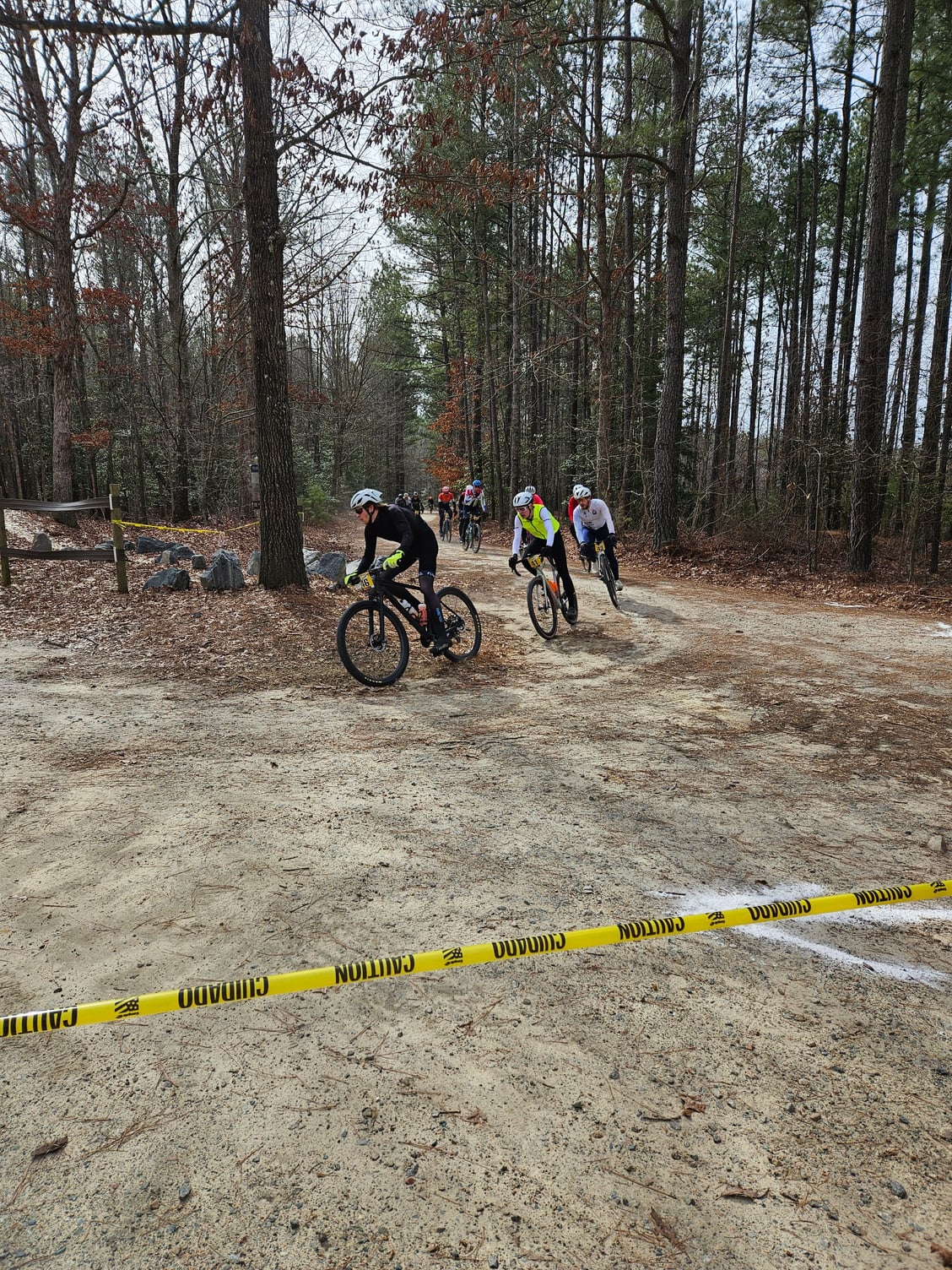
Here's a random PSA. Take it for what you think it's worth. One of the posters in this thread(and bike) was doing a gravely(Monster Cross) race Sunday morning relativley close to me, so I went out to spectate. I stood in a corner watching racers go by. Just my opinion, but if you want your bike/kit to stand out, light and bright beats dark and dull every day of the week and twice on Sundays. Light print/graphics on dark backgrounds are read easily, but are not exciting. Bright reds, blues, oranges, yellows, etc, even white are much better than the greys, charcoals and blacks. I even saw a couple of the oily spot frames come through. They don't stand out in a crowd as bikes are rolling past. The worst offenders are the dark/dark color combos. When the BF rider came by, I recognized his team letters and he resembles a couple of actors when they were at similar ages. At a glance, I had touble making out the bike brand. Same for the kits. Get yourself some colors. About the only thing that stands out on a dark kit is the colored accessories with it.
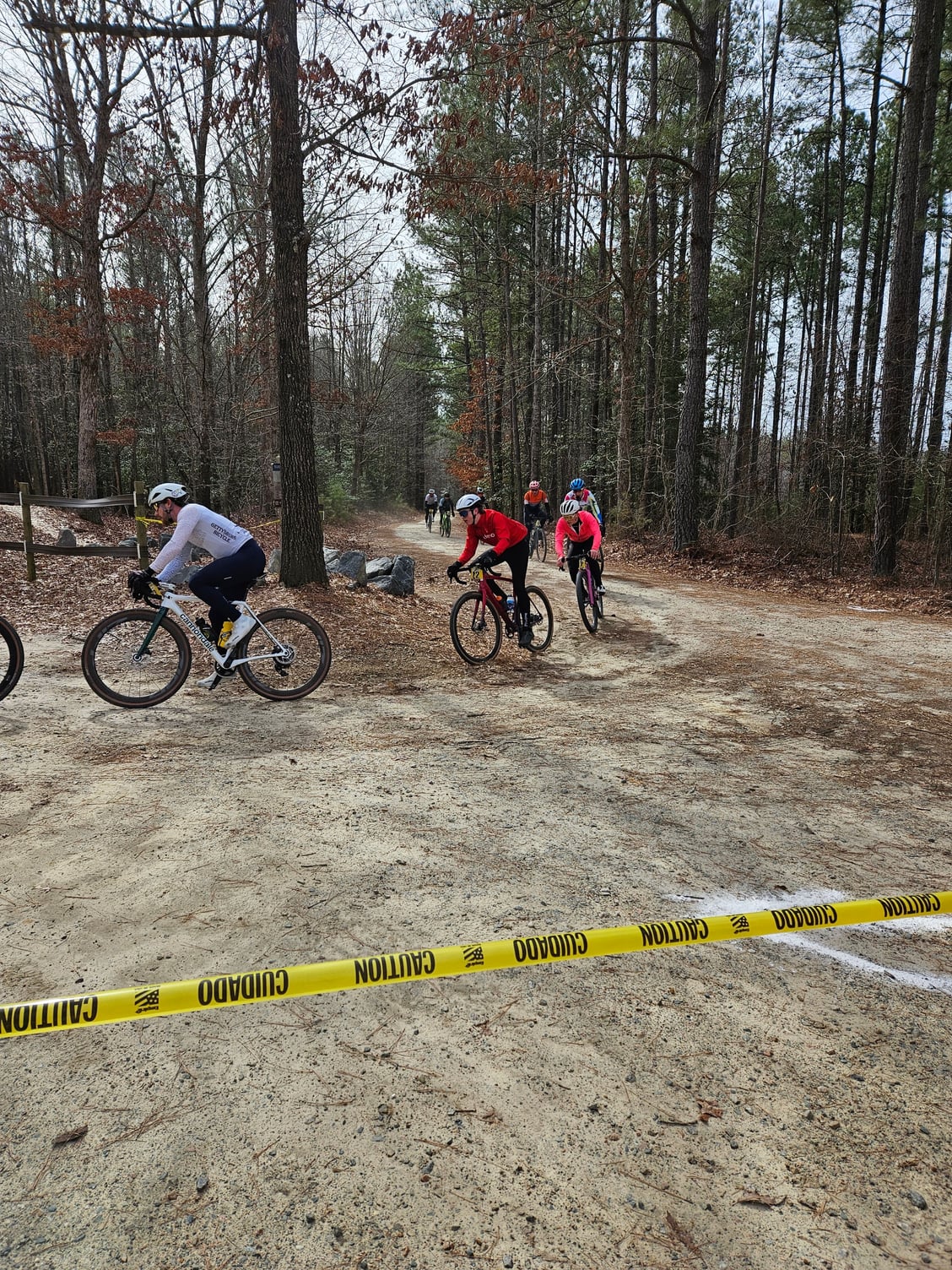
Look at these 2 pics for example: The dude in front in the black, meh. The only things that jump out are the gloves, helmet and water bottle. He also has the dreaded White Man's disease. Maybe he should see a doctor. The rest of the group behind him though, they're all looking sharp. BTW, the temp when the pics were taken was in the low 30s. The rider in the hot pink is super tough/hardcore!