Hot r Not
pluralis majestatis
Join Date: Feb 2004
Location: you rope
Posts: 4,206
Bikes: a DuhRosa
Likes: 0
Liked 5 Times
in
3 Posts
Cut the steerer tube and now it's completely slammed. I wish I had a more agressive stem but FSA does not make an 8* or 12* degree stem and I like the match of bars, stem and seatpost. This has to be the most beautiful bike I've ever seen in the flesh. Including Colnago C60 tricolores etc. There is something about all the colors coming together that makes it beautiful in my eyes. It rides pretty good too  .
.

 .
.
4.5/10 because i like decimals

It is debatable whether black, in itself, is gorgeous, but the reason black is associated with elegance is due to the way it recedes and allows a well-built, attractive form to get the attention it deserves. But if it isn't a well-built, attractive form to begin with, making it black is not going to make it gorgeous. In fact, it's more likely to make it look homely.
King Hoternot
Join Date: Jun 2010
Location: Oregon City, OR
Posts: 5,255
Bikes: 2015 Cannondale Evo Hi mod
Likes: 0
Liked 0 Times
in
0 Posts
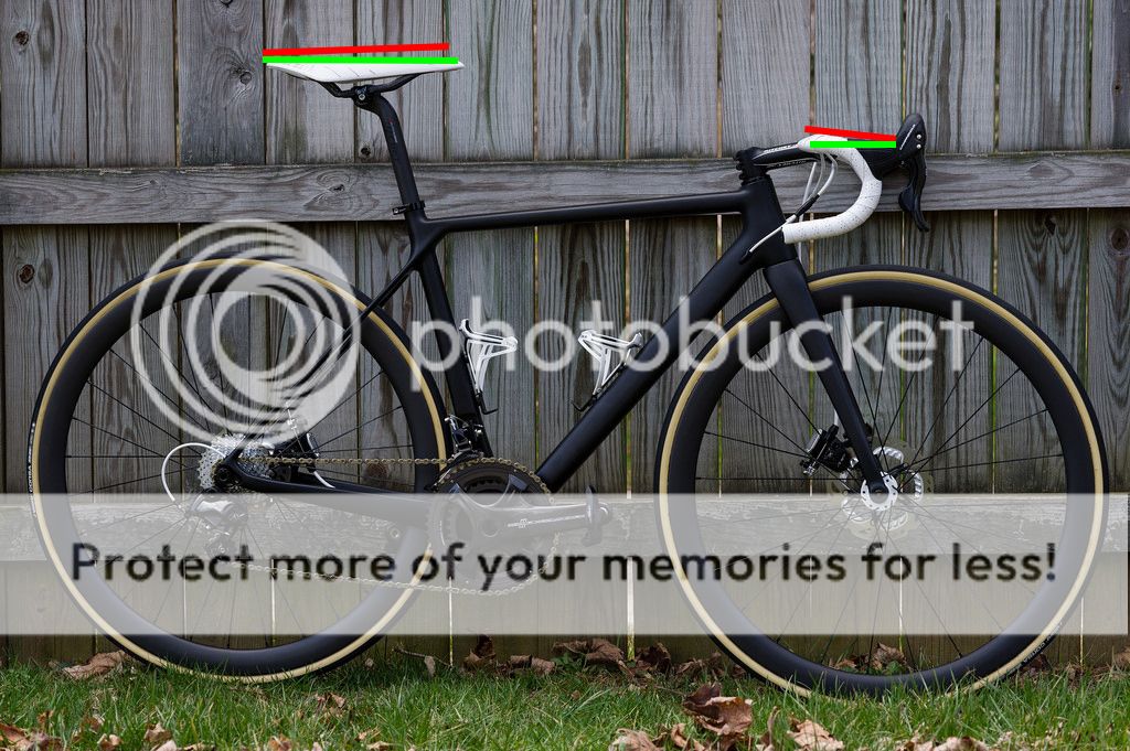
This is what I see. Red for the angles you have and green for what I would prefer to see on this.

Keep in mind those are just the things that my eye gets drawn to from a photography sense. Real life though, I may not have noticed.
Last edited by bianchi10; 04-03-17 at 09:45 PM.
Senior Member
I like it and I feel it could be really hot. The nose tilted up on the saddle combined with the downward angle of your top bar and hoods gives it a peak sort of set up Like ^. So what I would have liked to see is the bars rotated up till the hoods were flat and the saddle flattened out. Have never cared for colored cable housing so I would have preferred black. Would also prefer to see black cages, but I understand the tie in factor to the saddle and bartape. Since everything else is logo free, the logo's on the stem need to go ASAP.
This is what I see. Red for the angles you have and green for what I would prefer to see on this.
Keep in mind those are just the things that my eye gets drawn to from a photography sense. Real life though, I may not have noticed.
This is what I see. Red for the angles you have and green for what I would prefer to see on this.
Keep in mind those are just the things that my eye gets drawn to from a photography sense. Real life though, I may not have noticed.
 I geeked out over this bike for many, many hours so it's refreshing to see someone else caring even 1/100th as much as I did.
From the front, there are actually a few logos visible:

I'm also partial to the WCS rainbow stripes (look up 'rainbow baby' if curious to my personal reasons for that, my son, born Oct. 27, 2016, was a triple rainbow baby) so they won't be coming off. I was tempted to do a full rainbow themed paint job but will likely save that for my wife's next bike, and to avoid potentially awkward encounters.
I knew the nose-up saddle would draw criticism but I couldn't post the bike in any other way than how I'd ride it. And I like my saddles slightly nose up. Bars are tilted as far up as I can stand (aesthetically and functionally) relative to the angle of the drops so that won't be changing. White cages were always part of the color scheme and in person, the gloss finish of the hubs, bar tape, and cages really goes nicely together. The saddle, unfortunately, is more matte in finish. Perhaps I'll move to a full carbon saddle with white gloss paint one of these days, but until I find something I like as much as the Arione it is here to stay. The white housing was a late entry to the build and heavily debated but as noted previously, I think I'm happy with it. I have some graphics in mind to break up the matte black theme but need to finalize them still.
To further the over-analysis, some of the angles in the photo may be skewed by how I shot the photo. I currently don't have any lens sharper and longer than my 105mm so I went with it. As a result, I had to adjust my shooting position from straight on to get the handlebar drops to line up (you can see the result of this by looking at the misaligned seat and chain stays). To me, having the handlebar drops aligned is mission-critical for a good bike photo so this compromise was worth it in the short term. I need to get my hands on a sharp 200-300mm lens (or backup and crop) so that I can shoot straight on and not have the perspective distortion of the shorter lens. I also need to figure out a way to prop the bike up so that I can move it further from the background to unclutter that a bit. Finally, I need to fix the slight angle of my cranks and rotate my front wheel properly to hide the valve stem so that I don't need to clone it out again.
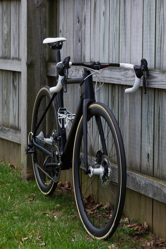
And by the way, I know the straight-on side view is standard for good reason, but the angular view from the front in this case is more revealing of what makes this black bike different from others. I think such a view should be required as well.
 This is still a puzzling bike to me, but the additional view gives it some life and indicates some charm.
Ride more, eat less
Join Date: Feb 2007
Location: Philla PA, Hoboken NJ, Brooklyn NY
Posts: 2,144
Bikes: Too many but never enough.
Liked 823 Times
in
504 Posts
BTW, the white saddle/bar tape combo works best when there is some white decals on the frame (or fork, or rims) to extend similar accents; minimal amount would do..
IMO, gumwall tires are ugly; better off with blackwall.
Last edited by cat0020; 04-04-17 at 06:25 AM.
Senior Member
Originally Posted by kbarch
And by the way, I know the straight-on side view is standard for good reason, but the angular view from the front in this case is more revealing of what makes this black bike different from others. I think such a view should be required as well.  This is still a puzzling bike to me, but the additional view gives it some life and indicates some charm.
 This is still a puzzling bike to me, but the additional view gives it some life and indicates some charm.
Senior Member
In my 20s, I hated gumwalls. I thought they were only meant for Schwinn Varsities and the like. As I've aged, gumwalls and particularly the 'cream' colored walls on these Vittorias, have really grown on me. I have true gumwalls on the Trek 660 and like them, too, on that bike. Most modern bikes covered in logos and such don't make for quite the right pairing with gumwalls, but I wouldn't consider anything else for the Hongfu or Trek.
Senior Member
That helps, but mostly I like the way it shows off the taper of the head tube and the general shapeliness of the frame.
Senior Member
Thread Starter
pluralis majestatis
Join Date: Feb 2004
Location: you rope
Posts: 4,206
Bikes: a DuhRosa
Likes: 0
Liked 5 Times
in
3 Posts
I think this is one of the best examples of skinwalls because they pair on rims with some fair depth and they set a pop from the stealth look.
Being that red and black is a pretty sinister combo that would have made for a great accent instead of white. That would be 9.7
Being that red and black is a pretty sinister combo that would have made for a great accent instead of white. That would be 9.7
Those handlebars look tiny
Disc brakes look hideous on road bikes
Senior Member


Boo! The handlebars are pretty short and shallow. The upside is I get to run a 110mm stem (vs. 100mm, you know, for a better score in this thread) and I have plenty of saddle to bar drop at the hoods (for a better score, and it's quite comfortable for me) while still having usable drops. They are very similar to the Ritchey Classics I have on my Trek and those work very well for me. Less compact drops would likely have required I go to the next size up frame to make them usable (which is how I used to build my bikes) but I like the aesthetics of the smaller frame that the compact bars allow, among the other functional traits. The discs are function over form, but I'm not offended by them either.
Boo! The handlebars are pretty short and shallow. The upside is I get to run a 110mm stem (vs. 100mm, you know, for a better score in this thread) and I have plenty of saddle to bar drop at the hoods (for a better score, and it's quite comfortable for me) while still having usable drops. They are very similar to the Ritchey Classics I have on my Trek and those work very well for me. Less compact drops would likely have required I go to the next size up frame to make them usable (which is how I used to build my bikes) but I like the aesthetics of the smaller frame that the compact bars allow, among the other functional traits. The discs are function over form, but I'm not offended by them either.
I like the bike, but there are some things I would have done differently. The stem length/handler/frame size choice is one, but I understand your reasoning.
Disc brakes look strange to me on road bikes, but probably because I have no need for them. It rarely rains here. They look fine on the Disc Trucker I'm borrowing from a friend.
I sorta like the tire choice, but prefer the darker color that Continental uses on their GP Classics.
Kit doesn't match
Looks great, nice work. I think I'd prefer black housing too, but who knows... and those campag levers are hideous, but that's not your fault 

Cut the steerer tube and now it's completely slammed. I wish I had a more agressive stem but FSA does not make an 8* or 12* degree stem and I like the match of bars, stem and seatpost. This has to be the most beautiful bike I've ever seen in the flesh. Including Colnago C60 tricolores etc. There is something about all the colors coming together that makes it beautiful in my eyes. It rides pretty good too  .
.
https://scontent-atl3-1.xx.fbcdn.net...66&oe=59611A82
 .
.https://scontent-atl3-1.xx.fbcdn.net...66&oe=59611A82
Senior Member
Of course. All of my responses have been in good fun. I love how the bike turned out so that's what matters.
Yup, lots of personal preferences dictating the outcome. While the discs may look out of place, you can't argue that the seat stay/seat tube junction and fork crown don't look super clean, though, right?
I'm curious how those darker sidewalls would look. But Continental doesn't make them in a tubular so for these wheels, I'll be sticking with the Vittorias.
I like the bike, but there are some things I would have done differently. The stem length/handler/frame size choice is one, but I understand your reasoning.
Disc brakes look strange to me on road bikes, but probably because I have no need for them. It rarely rains here. They look fine on the Disc Trucker I'm borrowing from a friend.
I sorta like the tire choice, but prefer the darker color that Continental uses on their GP Classics.
Disc brakes look strange to me on road bikes, but probably because I have no need for them. It rarely rains here. They look fine on the Disc Trucker I'm borrowing from a friend.
I sorta like the tire choice, but prefer the darker color that Continental uses on their GP Classics.
I'm curious how those darker sidewalls would look. But Continental doesn't make them in a tubular so for these wheels, I'll be sticking with the Vittorias.
Senior Member
I might have nudged them a tiny bit higher, too, but they are pushed all the way to the top of the 'no-slip grit' on the drops already. I think if I went any further I'd start running into the 'tops' section of the bars and my levers would get angled all wonky. I could rotate the bars up just a tad as suggested by others to correct the appearance there. But I know I won't like the resulting angle of the drops. So torn...
Senior Member
Join Date: Jun 2014
Location: Houston, TX/Austin, TX
Posts: 79
Bikes: 1997 Romic Neo-Retro, 2015 Ridley Ignite 27.5, Mercier Nano
Likes: 0
Liked 0 Times
in
0 Posts
Recusant Iconoclast
Senior Member
Join Date: Nov 2013
Location: Southern California
Posts: 1,416
Bikes: 2019 Supersix Evo, 2002 Trek 2000
Liked 45 Times
in
32 Posts
Senior Member
Join Date: Jul 2012
Location: Atlanta GA
Posts: 2,844
Bikes: '13 Spech Roubaix SL4 Expert
Likes: 0
Liked 0 Times
in
0 Posts
to be quite honest, this bike does not photograph well (or the photographer sucks). I have seen many beautiful bikes and I will have to say that to me, this is the best setup I've seen. it does not ride as good as others might but as far as looks it's great.
__________________
Cat 6 going on PRO....
Cat 6 going on PRO....


