


Why do some dislike Trek bicycles / corporation?
 02-01-24, 03:36 PM
#201
Senior Member
Join Date: Aug 2009
Posts: 1,820
Mentioned: 5 Post(s)
Tagged: 0 Thread(s)
Quoted: 505 Post(s)
Liked 639 Times
in
378 Posts
I wouldn't be actively looking for one. As Eric F said tons of examples out there. Those Zunow built IMs that Dave Scott stashed around the country and rode come to mind. Lots of brands with World Champion stripes were rebadged other brands. But, back to those Huffies. Are you sure they were made by Serotta? 
https://www.cyclingnews.com/features...-giro-ditalia/
https://www.cyclingnews.com/features...-giro-ditalia/
 02-01-24, 04:25 PM
#202
Senior Member

Join Date: Oct 2015
Posts: 15,496
Bikes: 2015 Workswell 066, 2017 Workswell 093, 2014 Dawes Sheila, 1983 Cannondale 500, 1984 Raleigh Olympian, 2007 Cannondale Rize 4, 2017 Fuji Sportif 1 LE
Mentioned: 144 Post(s)
Tagged: 0 Thread(s)
Quoted: 7653 Post(s)
Liked 3,485 Times
in
1,840 Posts
See ... when you post ignorant and wholly invented crap like this, people tend to think that maybe your claims are unreliable and your opinions are pure BS.
Nobody care what bike you ride if everything you post is nonsense.
Likes For Maelochs:
02-01-24, 06:30 PM
#203

climber has-been

Join Date: Dec 2004
Location: Palo Alto, CA
Posts: 7,111
Bikes: Scott Addict R1, Felt Z1
Mentioned: 10 Post(s)
Tagged: 0 Thread(s)
Quoted: 3432 Post(s)
Liked 3,567 Times
in
1,793 Posts
As you documented, Hampsten's was built by Land Shark. It's fairly well known that Serotta built most of the 7-Eleven bikes, branded as Murray and Huffy.... https://roadbikeaction.com/the-real-...ven-team-bikes
__________________
Ride, Rest, Repeat. ROUVY: terrymorse

Ride, Rest, Repeat. ROUVY: terrymorse
Likes For terrymorse:
02-02-24, 07:25 AM
#204
se�or miembro

Join Date: Dec 2018
Location: Pac NW
Posts: 6,629
Bikes: '70s - '80s Campagnolo
Mentioned: 92 Post(s)
Tagged: 0 Thread(s)
Quoted: 3891 Post(s)
Liked 6,491 Times
in
3,213 Posts
 02-02-24, 07:58 AM
#205
Senior Member
Join Date: Dec 2016
Location: Long Island, NY
Posts: 2,112
Bikes: Trek 800 x 2, Schwinn Heavy Duti, Schwinn Traveler, Schwinn Le Tour Luxe, Schwinn Continental, Cannondale M400 and Lambert, Schwinn Super Sport
Mentioned: 14 Post(s)
Tagged: 0 Thread(s)
Quoted: 811 Post(s)
Liked 1,024 Times
in
666 Posts
I know that sometimes you have to "Stand by your man".
For me, it is buying and then dissolving brands. It appears that Bontreger is going to be the latest victim. This is nothing new in business though.
So, I don't dislike them. I just like them less than I used to.
For me, it is buying and then dissolving brands. It appears that Bontreger is going to be the latest victim. This is nothing new in business though.
So, I don't dislike them. I just like them less than I used to.
Likes For Steel Charlie:
02-02-24, 10:19 AM
#208
Senior Member
Join Date: Dec 2019
Location: 757
Posts: 11,255
Bikes: Madone, Emonda, 5500, Ritchey Breakaway
Mentioned: 3 Post(s)
Tagged: 0 Thread(s)
Quoted: 10238 Post(s)
Liked 5,189 Times
in
2,226 Posts
I think trek is removing bontrager from everything except the wheels. I forgot what my buddy said about it. The good news, expect some crazy sales soon on bontrager products.
02-02-24, 02:44 PM
#209
Senior Member
Join Date: Oct 2015
Posts: 15,496
Bikes: 2015 Workswell 066, 2017 Workswell 093, 2014 Dawes Sheila, 1983 Cannondale 500, 1984 Raleigh Olympian, 2007 Cannondale Rize 4, 2017 Fuji Sportif 1 LE
Mentioned: 144 Post(s)
Tagged: 0 Thread(s)
Quoted: 7653 Post(s)
Liked 3,485 Times
in
1,840 Posts
I have no clue but I would assume that whatever contract Trek had with Bontrager had a time limit and that limit has been reached, and in the future Trek will brand its own parts. By now, I think only old people remember when the name Bontrager had any meaning, so it is no longer a marketing tool ... it is just "Trek's house brand."
I am sure Keith Bontrager has long since cashed out for as much cash as he could get and could do pretty much anything he wanted ... seeing his name on a random bike stem probably doesn't elevate his heart rate much.
I am sure Keith Bontrager has long since cashed out for as much cash as he could get and could do pretty much anything he wanted ... seeing his name on a random bike stem probably doesn't elevate his heart rate much.
Likes For Maelochs:
02-02-24, 05:50 PM
#210
Resident PIA

Join Date: Jul 2004
Location: City of Oaks, NC
Posts: 848
Bikes: Gunnar Roadie, Look 765 Optimum, Spesh Aethos
Mentioned: 0 Post(s)
Tagged: 0 Thread(s)
Quoted: 212 Post(s)
Liked 356 Times
in
186 Posts
__________________
--
Shad
I knew where I was when I wrote this
I don't know where I am now...
05 Gunnar Roadie Chorus/Record
67'er
--
Shad
I knew where I was when I wrote this
I don't know where I am now...
05 Gunnar Roadie Chorus/Record
67'er
 02-03-24, 01:05 PM
#213
climber has-been
Join Date: Dec 2004
Location: Palo Alto, CA
Posts: 7,111
Bikes: Scott Addict R1, Felt Z1
Mentioned: 10 Post(s)
Tagged: 0 Thread(s)
Quoted: 3432 Post(s)
Liked 3,567 Times
in
1,793 Posts
 02-03-24, 07:33 PM
#216
climber has-been
Join Date: Dec 2004
Location: Palo Alto, CA
Posts: 7,111
Bikes: Scott Addict R1, Felt Z1
Mentioned: 10 Post(s)
Tagged: 0 Thread(s)
Quoted: 3432 Post(s)
Liked 3,567 Times
in
1,793 Posts

Likes For terrymorse:
02-03-24, 07:36 PM
#217
Newbie
I don't care about their marketing, my Madone just fits and feels fast. My favorite bike. It's way faster than my abilities. But, it just feels right.
Plus, my LBS in Altoona always treats me well.
Can't ask for much more.
I might start whining though, if the seat breaks off. lol
Plus, my LBS in Altoona always treats me well.
Can't ask for much more.
I might start whining though, if the seat breaks off. lol
02-03-24, 07:41 PM
#218
I am potato.

Join Date: Jun 2015
Location: Pacific Northwest
Posts: 3,116
Bikes: Only precision built, custom high performance elitist machines of the highest caliber. 🍆
Mentioned: 29 Post(s)
Tagged: 0 Thread(s)
Quoted: 1790 Post(s)
Liked 1,631 Times
in
934 Posts
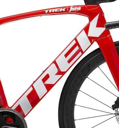
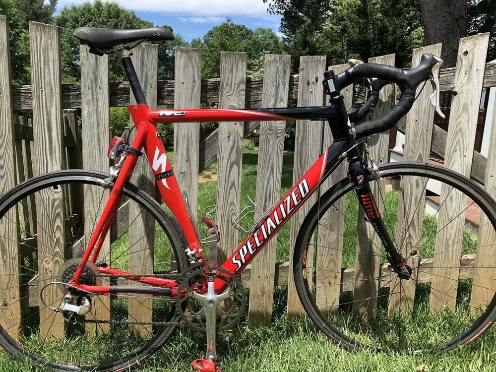
That down tube hurts to just look at it. It screams hungry graphic design gig worker.
I like red/white together. But, I wouldn't buy that bike because that, whatever that is, is over the top awful.
It's like the ever growing hood ornaments and insignia on cars nowadays. It used to be that a brand had an image, a style, some identifying feature that set it apart. Think the shape of a Coke bottle or Jeeps 7 vertical bars on the grill. Or even the driver side window forward drop near the mirrors on a Ford truck...Instantly recognizable as a defining characteristic of a brand. Now, the logo is so often the defining feature. Lazy. Desperate. Billboard for status seeking fools.
That down tube cheapens Trek.
Last edited by base2; 02-03-24 at 07:45 PM.
02-03-24, 08:17 PM
#220
Resident PIA
Join Date: Jul 2004
Location: City of Oaks, NC
Posts: 848
Bikes: Gunnar Roadie, Look 765 Optimum, Spesh Aethos
Mentioned: 0 Post(s)
Tagged: 0 Thread(s)
Quoted: 212 Post(s)
Liked 356 Times
in
186 Posts
That down tube hurts to just look at it. It screams hungry graphic design gig worker.
I like red/white together. But, I wouldn't buy that bike because that, whatever that is, is over the top awful.
It's like the ever growing hood ornaments and insignia on cars nowadays. It used to be that a brand had an image, a style, some identifying feature that set it apart. Think the shape of a Coke bottle or Jeeps 7 vertical bars on the grill. Or even the driver side window forward drop near the mirrors on a Ford truck...Instantly recognizable as a defining characteristic of a brand. Now, the logo is so often the defining feature. Lazy. Desperate. Billboard for status seeking fools.
That down tube cheapens Trek.
I like red/white together. But, I wouldn't buy that bike because that, whatever that is, is over the top awful.
It's like the ever growing hood ornaments and insignia on cars nowadays. It used to be that a brand had an image, a style, some identifying feature that set it apart. Think the shape of a Coke bottle or Jeeps 7 vertical bars on the grill. Or even the driver side window forward drop near the mirrors on a Ford truck...Instantly recognizable as a defining characteristic of a brand. Now, the logo is so often the defining feature. Lazy. Desperate. Billboard for status seeking fools.
That down tube cheapens Trek.
.
__________________
--
Shad
I knew where I was when I wrote this
I don't know where I am now...
05 Gunnar Roadie Chorus/Record
67'er
--
Shad
I knew where I was when I wrote this
I don't know where I am now...
05 Gunnar Roadie Chorus/Record
67'er
Likes For Shadco:
02-03-24, 08:31 PM
#221
Senior Member
Join Date: Mar 2010
Posts: 1,660
Mentioned: 7 Post(s)
Tagged: 0 Thread(s)
Quoted: 1248 Post(s)
Liked 1,323 Times
in
674 Posts
That down tube hurts to just look at it. It screams hungry graphic design gig worker.
I like red/white together. But, I wouldn't buy that bike because that, whatever that is, is over the top awful.
It's like the ever growing hood ornaments and insignia on cars nowadays. It used to be that a brand had an image, a style, some identifying feature that set it apart. Think the shape of a Coke bottle or Jeeps 7 vertical bars on the grill. Or even the driver side window forward drop near the mirrors on a Ford truck...Instantly recognizable as a defining characteristic of a brand. Now, the logo is so often the defining feature. Lazy. Desperate. Billboard for status seeking fools.
That down tube cheapens Trek.
I like red/white together. But, I wouldn't buy that bike because that, whatever that is, is over the top awful.
It's like the ever growing hood ornaments and insignia on cars nowadays. It used to be that a brand had an image, a style, some identifying feature that set it apart. Think the shape of a Coke bottle or Jeeps 7 vertical bars on the grill. Or even the driver side window forward drop near the mirrors on a Ford truck...Instantly recognizable as a defining characteristic of a brand. Now, the logo is so often the defining feature. Lazy. Desperate. Billboard for status seeking fools.
That down tube cheapens Trek.
Last edited by Atlas Shrugged; 02-03-24 at 09:21 PM.
Likes For Atlas Shrugged:
02-04-24, 12:18 AM
#222
I am potato.
Join Date: Jun 2015
Location: Pacific Northwest
Posts: 3,116
Bikes: Only precision built, custom high performance elitist machines of the highest caliber. 🍆
Mentioned: 29 Post(s)
Tagged: 0 Thread(s)
Quoted: 1790 Post(s)
Liked 1,631 Times
in
934 Posts
Seriously? Remember the Trans Am screaming chicken on the hood, HEMI plastered on the side of some garishly purple or mint green car. From what I recall Masi, Pinarello, Olmo etc. took up the whole down down tube in contrasting colours, just it was small tube that�s all. Back in the day all bikes were effectively made from the same materials and looked identical other than paint and graphics, that was a time of �status seeking fools� because effectively they were all the same if that is your perspective. There are many examples of modern bicycles with very subtle graphics and yet the same old men who yell at clouds complain about those boring blacked out bikes. Trying to build a case around one extreme example is sad. Then insulting them is pathetic.
Give this a read:
Martin Lindstrom
TLDR;
There are only a few brands that would pass the Smash Your Brand test today. Take a moment to consider it. If you were to remove your logo and any other textual reference to your brand name, would your customers still recognize the product as yours? Chances are that you will find that without the logo and name, your brand loses its meaning.
Remember branding is everything but a logo � it�s a way to add a characteristic personality to your brand including every component creating a true point of difference.
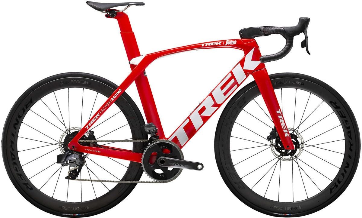
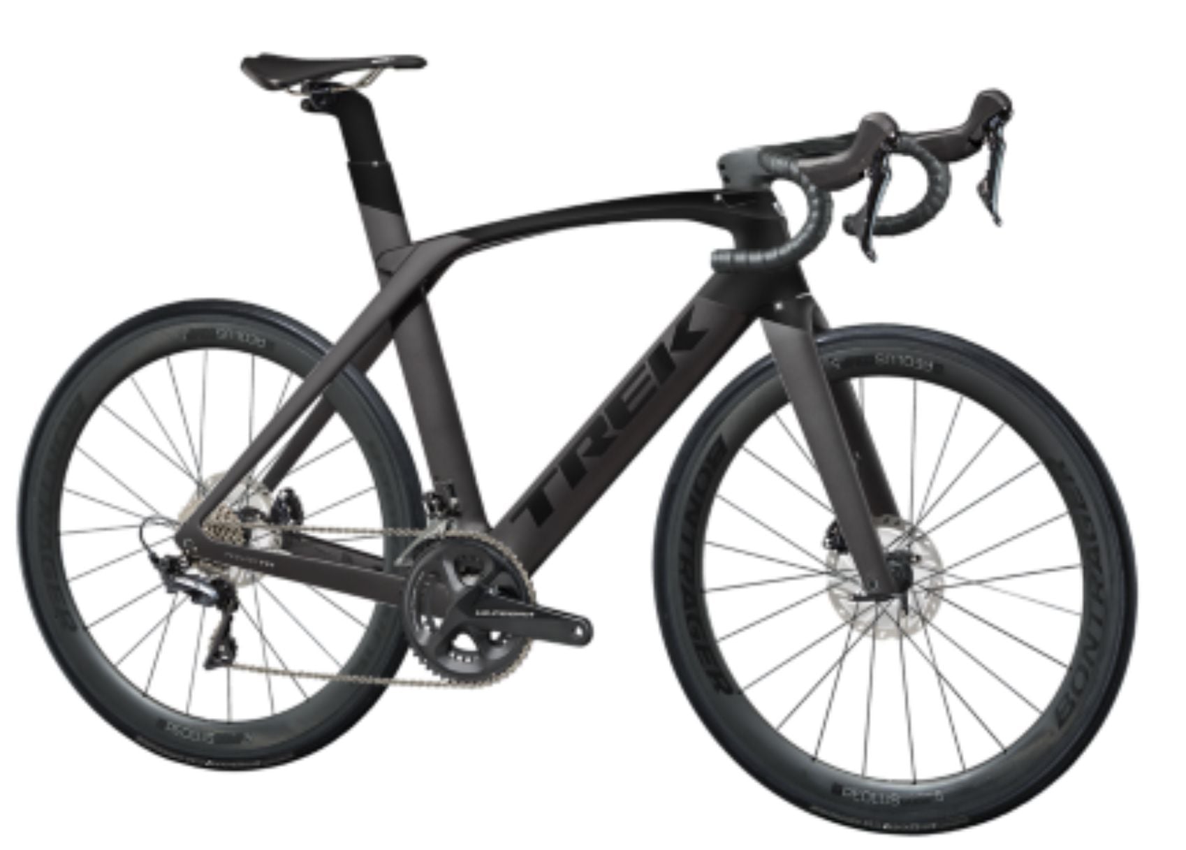
At least the all black, blacked out image you provide allows the unique silhouette shape and other proportions of frame design to become apparent. The name is there. But the company manufacture is the least important aspect of the product identity. Paint & graphics is not "brand."
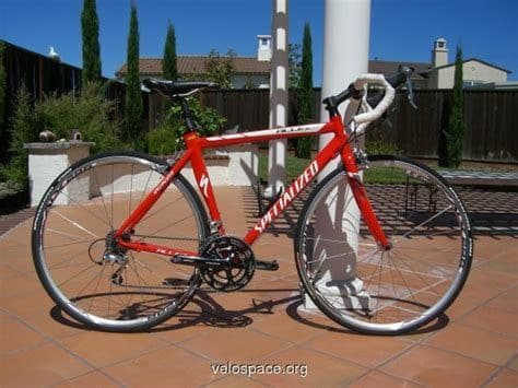
The second bike, as far as these things go, sort of gets it "right." It is unmistakably Trek by way of bulbous head tube top tube junction, top tube curvature flowing to seat stay & seat mast designs among other features. Features you don't get to see in the red/white example because it is so garish to look at. The design, it says "Trek" moreso than the graphics. In this particular case, in spite of the graphics.
To be fair, neither is very good at establishing a unique identity. That's probably the reason for the billboard in the first place. I stand by my original assertion.
Last edited by base2; 02-04-24 at 01:15 AM.
02-04-24, 09:17 AM
#223

Senior Member

Join Date: Jan 2005
Location: Baltimore, MD
Posts: 5,383
Mentioned: 15 Post(s)
Tagged: 0 Thread(s)
Quoted: 2490 Post(s)
Liked 2,961 Times
in
1,682 Posts
I think you've missed the point.
Give this a read:
Martin Lindstrom
TLDR;
In conclusion:
The red/white Trek in the picture isn't the only failure. It is one of many. The giant billboard is a hack. It's a cheat code for personality. It totally overpowers and blots out all other potential genuine differentiating aspects of the bike. In short, that logo, in that way...It subtracts value.
At least the all black, blacked out image you provide allows the unique silhouette shape and other proportions of frame design to become apparent. The name is there. But the company manufacture is the least important aspect of the product identity. Paint & graphics is not "brand."
The second bike, as far as these things go, sort of gets it "right." It is unmistakably Trek by way of bulbous head tube top tube junction, top tube curvature flowing to seat stay & seat mast designs among other features. Features you don't get to see in the red/white example because it is so garish to look at. The design, it says "Trek" moreso than the graphics. In this particular case, in spite of the graphics.
To be fair, neither is very good at establishing a unique identity. That's probably the reason for the billboard in the first place. I stand by my original assertion.
I always enjoy reading the "what is this bike?" C&V threads that crop up frequently. Remove the decals from any of a thousand steel 1"-top-tube-1 1/8"-down-tube '70's and '80's bike models, change the components, and repaint, and it will usually take several of the resident experts and at least a dozen or more posts before a guarded consensus emerges, if it ever does.
Which explains why, back in the days when the body governing British bike racing prohibited the application of frame decals for advertising the bike brand, builders resorted to the use of unusual and easily identifiable features (e.g., Hellenic or wavy stays).
Those Treks, and other modern bikes, will likely be no more difficult to identify in the future than those C&V steel bikes.
Likes For Trakhak:
02-04-24, 10:11 AM
#224
Senior Member
Join Date: Apr 2009
Posts: 942
Mentioned: 5 Post(s)
Tagged: 0 Thread(s)
Quoted: 380 Post(s)
Liked 541 Times
in
286 Posts
I have one of each of these. I really don't care for the gross logos but it is easy to live with since they're such great rides.
And totally black bikes are totally boring. A simple truth, not opinion.
And totally black bikes are totally boring. A simple truth, not opinion.
Likes For Steel Charlie:
02-04-24, 05:28 PM
#225
Senior Member
Join Date: Jan 2023
Location: Eastern Shore MD
Posts: 884
Bikes: Lemond Zurich/Trek ALR/Giant TCX/Sette CX1
Mentioned: 1 Post(s)
Tagged: 0 Thread(s)
Quoted: 570 Post(s)
Liked 773 Times
in
404 Posts
Logo’s, talk about logo’s…
This is a bike from the other side of the Trek story… he couldn’t fit his brand on enough places of the bike!! (And I love it)
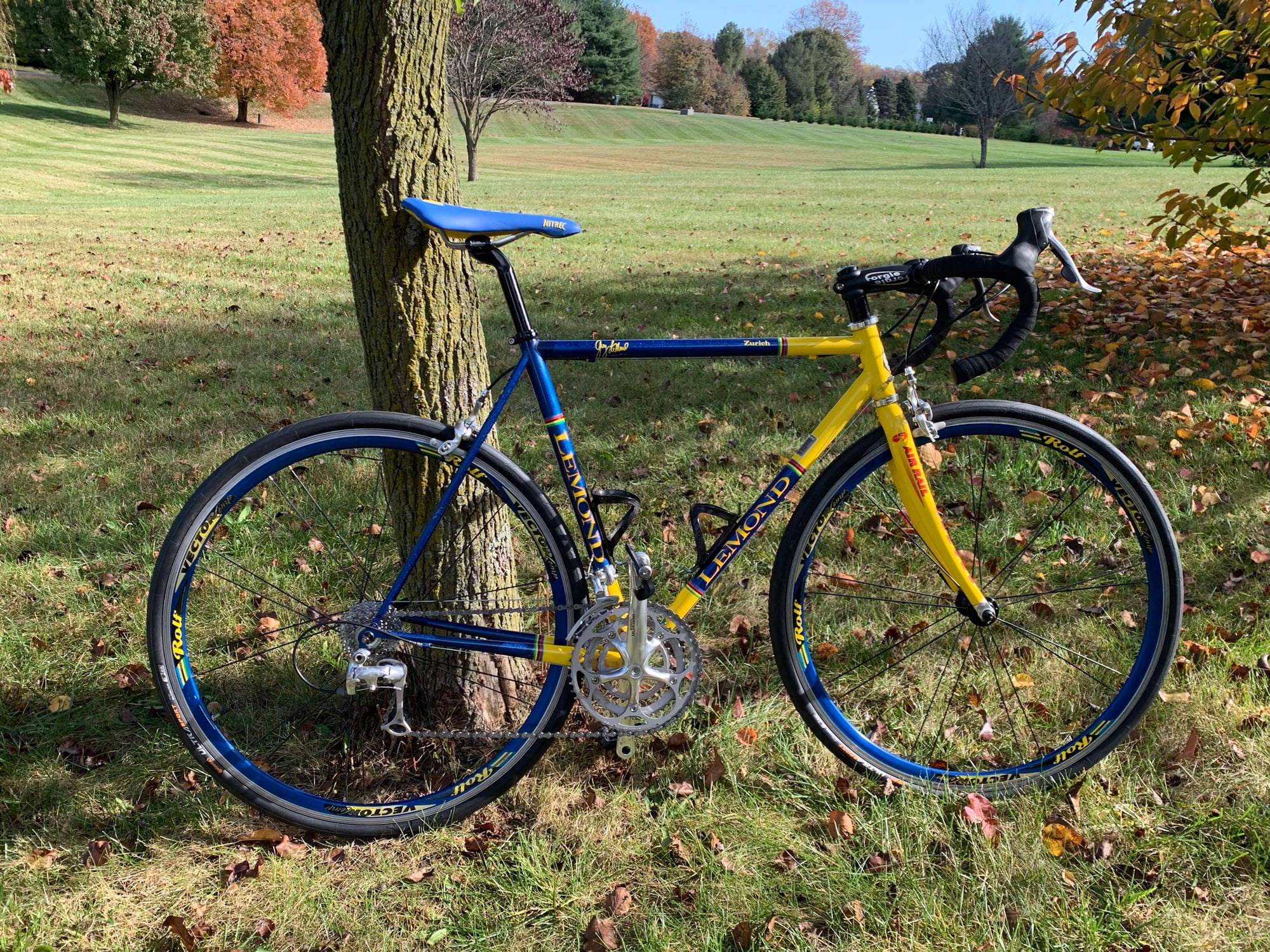
This is a bike from the other side of the Trek story… he couldn’t fit his brand on enough places of the bike!! (And I love it)
Likes For Jughed: